
Feldschlösschen is celebrating its 150th anniversary, and we’ve taken this opportunity not only to look back at the past but also to look toward the future. That’s why the brand is adopting a new visual identity. But don’t worry—we haven’t completely overhauled everything all at once.
But why a revision, after all? 🤔
Over the decades, Feldschlösschen has evolved. New beers, new packaging, new advertising campaigns, and—as time has gone by—various designs and styles. So at some point, the question naturally arises: What really sets us apart, after all? And how can we ensure that Feldschlösschen is recognizable at first glance? This is exactly where Feldschlösschen’s visual redesign comes into play. Less visual clutter, more clarity. And above all: more Feldschlösschen. ❤️
The castle belongs to everyone 🏰
At the center stands the red castle. A symbol of Feldschlösschen for generations, it plays an even more important role in the new visual identity.
The idea behind it all: the castle of Switzerland. Or, to put it more simply: this castle doesn’t just belong to the brand. It belongs to everyone who shares enjoyable moments together. Whether it’s over a beer after work, at a festival, at a barbecue, or simply during an evening with friends. Wherever people get together and raise a toast, that place is, in a way, their castle too. 🫶
So much history. Told with a fresh perspective. ✨
There’s even more Feldschlösschen in the new packaging. Fine illustrations showcase elements from the history of the brewery and our strong connection to Switzerland: the brewery’s horses 🐴, founder Theophil Roniger, the fermentation vats, and, of course, the ingredients that make up the beer. These are small details that you might not notice at first glance. But that’s exactly what makes it all so fascinating.
Feldschlösschen’s new design thus combines the brand’s history with a modern image.
Not only is it beautiful, but it’s also practical 🛒
The new design isn’t just meant to be visually appealing. It’s also intended to help shoppers find their way around the aisles more quickly.
The various products now have greater visual consistency, while remaining easily recognizable. During testing, the new visual identity was perceived as more modern and upscale, and the products were identified more quickly. In short: less searching, more discovery. 🍻
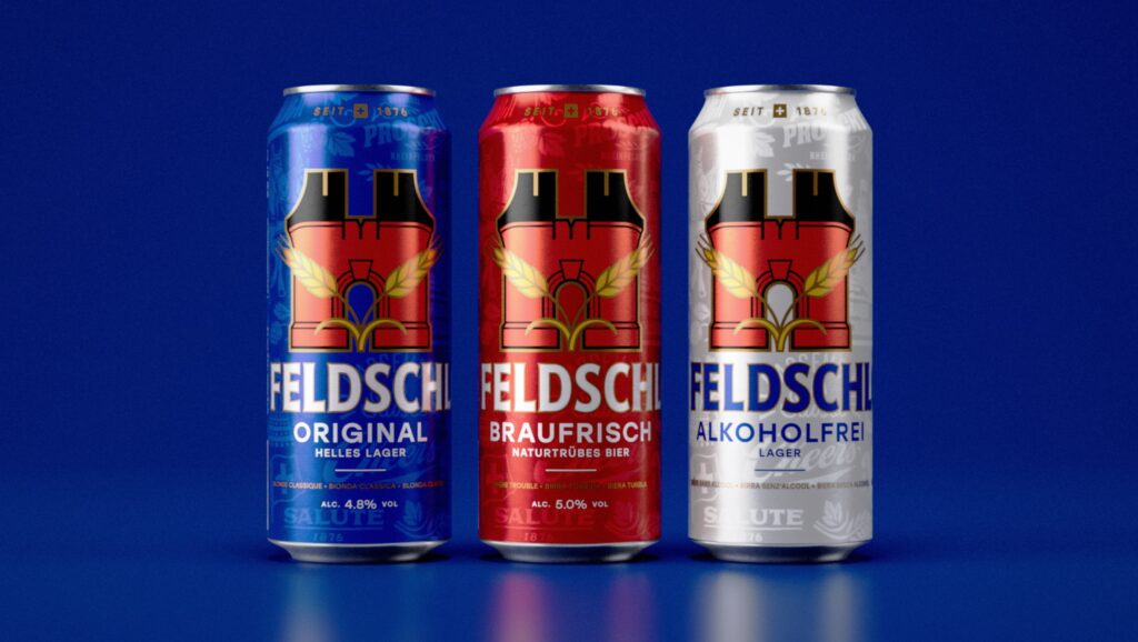
A new design. Still the same Feldschlösschen. ❤️
A refresh of Feldschlösschen’s visual identity after 150 years does not mean turning our backs on our history. On the contrary: we have taken a closer look at what has defined the very essence of Feldschlösschen for generations, and it is precisely this that we are translating into a contemporary style.
The castle remains. History remains. And, hopefully, so do the good times.
Feldschlösschen is ready for the next 150 years. 🚀
Log in to write a comment.